Sass
- CSS pre-processor 로써, 복잡한 작업을 쉽게 할 수 있게 해주고, 코드의 재활용성을 높여줄 뿐만 아니라, 코드의 가독성을 높여주어 유지보수를 쉽게 해줌.
Sass / Scss 의 문법 차이
sass
$font-stack:    Helvetica, sans-serif
$primary-color: #333

body
  font: 100% $font-stack
  color: $primary-color
scss
$font-stack:    Helvetica, sans-serif;
$primary-color: #333;

body {
  font: 100% $font-stack;
  color: $primary-color;
}
보통은 scss 문법이 더 많이 사용됨.
Sass 사용하기
리액트 프로젝트 만들기
$ npx create-react-app styling-with-sass
node-sass 라는 라이브러리 설치하기
$ yarn add node-sass$ npm i node-sasssass 를 css 로 변환해주는 역할을 하는 라이브러리임.
Button 예제
기본 버튼 만들기
Button.jsx
import React from "react";
import "./Button.scss";

const Button = ({ children }) => {
  return <button className="Button">{children}</button>;
};

export default Button;
Button.scss
$blue: #228be6; // 주석 선언

.Button {
  display: inline-flex;
  color: white;
  font-weight: bold;
  outline: none;
  border-radius: 4px;
  line-height: 2.25rem;
  border: none;
  cursor: pointer;

  height: 2.25rem;
  padding-left: 1rem;
  padding-right: 1rem;
  font-size: 1rem;

  background: $blue; // 주석 사용
  &:hover {
    background: lighten($blue, 10%); // 색상 10% 밝게
  }

  &:active {
    background: darken($blue, 10%); // 색상 10% 어둡게
  }
}
1. $blue : #228be6; 과 같이 스타일 파일에서 사용할 수 있는 변수를 선언할 수 있음.
2. lighten() 과 darken() 같은 색상을 더 밝게하거나 어둡게 해주는 함수를 사용할 수 있음.
App.js
import Button from './components/Button';
import "./App.scss"

function App() {
  return (
    <div className="App">
      <div className="buttons">
        <Button>BUTTON</Button>
      </div>
    </div>
  );
}

export default App;
App.scss
.App {
    width: 512px;
    margin: 0 auto;
    margin-top: 4rem;
    border: 1px solid black;
    padding: 1rem;
  }
버튼 사이즈 조정하기
버튼 크기에 large, medium, small 을 설정할 수 있도록 구현
classnames 라이브러리 사용하기
classNames 를 사용하면 조건부 스타일링을 할 때 함수의 인자에 문자열, 배열, 객체 등을 전달하여 손쉽게 문자열을 조합할 수 있음.
설치하기
$ yarn add classnames$ npm i classnames예제
classNames('foo', 'bar'); // => 'foo bar'
classNames('foo', { bar: true }); // => 'foo bar'
classNames({ 'foo-bar': true }); // => 'foo-bar'
classNames({ 'foo-bar': false }); // => ''
classNames({ foo: true }, { bar: true }); // => 'foo bar'
classNames({ foo: true, bar: true }); // => 'foo bar'
classNames(['foo', 'bar']); // => 'foo bar'

// 동시에 여러개의 타입으로 받아올 수 도 있습니다.
classNames('foo', { bar: true, duck: false }, 'baz', { quux: true }); // => 'foo bar baz quux'

// false, null, 0, undefined 는 무시됩니다.
classNames(null, false, 'bar', undefined, 0, 1, { baz: null }, ''); // => 'bar 1'
import React from "react";
import "./Button.scss";

function Button({ children, size }) {
  return <button className={`Button ${size}`}>{children}</button>;
}

Button.defaultProps = {
  size: "medium",
};

export default Button;
defaultProps 를 사용해서 size 의 기본 값을 medium 으로 설정했음.
Button.jsx (classnames 사용후)
import classNames from "classnames";
import React from "react";
import "./Button.scss";

function Button({ children, size }) {
  return <button className={classNames('Button', size)}>{children}</button>;
}

Button.defaultProps = {
  size: "medium",
};

export default Button;
Button.scss
$blue: #228be6;

.Button {
  display: inline-flex;
  color: white;
  font-weight: bold;
  outline: none;
  border-radius: 4px;
  border: none;
  cursor: pointer;

  // 사이즈 관리
  &.large {
    height: 3rem;
    padding-left: 1rem;
    padding-right: 1rem;
    font-size: 1.25rem;
    line-height: 3rem;
  }

  &.medium {
    height: 2.25rem;
    padding-left: 1rem;
    padding-right: 1rem;
    font-size: 1rem;
    line-height: 2.25rem;
  }

  &.small {
    height: 1.75rem;
    font-size: 0.875rem;
    padding-left: 1rem;
    padding-right: 1rem;
    line-height: 1.75rem;
  }

  background: $blue;
  &:hover {
    background: lighten($blue, 10%);
  }

  &:active {
    background: darken($blue, 10%);
  }
}
& 가 의미하는 것 (Parent Selector)
.Button { &.large { } }.Button.large { }부모를 선택한다고 생각하면 된다.
App.js
import Button from './components/Button';
import "./App.scss"

function App() {
  return (
    <div className="App">
      <div className="buttons">
        <Button size="small">BUTTON</Button>
        <Button>BUTTON</Button>
        <Button size="large">BUTTON</Button>
      </div>
    </div>
  );
}

export default App;
버튼 간격 조정하기
Button.scss
$blue: #228be6;

.Button {
  display: inline-flex;
  color: white;
  font-weight: bold;
  outline: none;
  border-radius: 4px;
  border: none;
  cursor: pointer;

  // 사이즈 관리
  &.large {
    height: 3rem;
    padding-left: 1rem;
    padding-right: 1rem;
    font-size: 1.25rem;
    line-height: 3rem;
  }

  &.medium {
    height: 2.25rem;
    padding-left: 1rem;
    padding-right: 1rem;
    font-size: 1rem;
    line-height: 2.25rem;
  }

  &.small {
    height: 1.75rem;
    font-size: 0.875rem;
    padding-left: 1rem;
    padding-right: 1rem;
    line-height: 1.75rem;
  }

  background: $blue;
  &:hover {
    background: lighten($blue, 10%);
  }

  &:active {
    background: darken($blue, 10%);
  }

  & + & {
    margin-left: 1rem;
  }
}
& + & = .Button + .Button
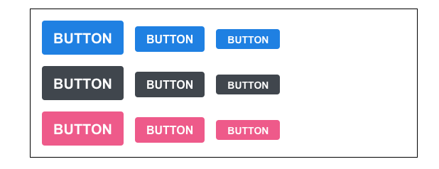
버튼 색상 설정하기
버튼의 색상에 blue, gray, pink 색을 설정 할 수 있도록 구현
Button.jsx
import classNames from "classnames";
import React from "react";
import "./Button.scss";

function Button({ children, size, color }) {
  return <button className={classNames('Button', size, color)}>{children}</button>;
}

Button.defaultProps = {
  size: "medium",
  color : "blue"
};

export default Button;
Button.scss
$blue: #228be6;
$gray: #495057;
$pink: #f06595;

.Button {
  display: inline-flex;
  color: white;
  font-weight: bold;
  outline: none;
  border-radius: 4px;
  border: none;
  cursor: pointer;

  // 사이즈 관리
  &.large {
    height: 3rem;
    padding-left: 1rem;
    padding-right: 1rem;
    font-size: 1.25rem;
    line-height: 3rem;
  }

  &.medium {
    height: 2.25rem;
    padding-left: 1rem;
    padding-right: 1rem;
    font-size: 1rem;
    line-height: 2.25rem;
  }

  &.small {
    height: 1.75rem;
    font-size: 0.875rem;
    padding-left: 1rem;
    padding-right: 1rem;
    line-height: 1.75rem;
  }

   // 색상 관리
   &.blue {
    background: $blue;
    &:hover {
      background: lighten($blue, 10%);
    }

    &:active {
      background: darken($blue, 10%);
    }
  }

  &.gray {
    background: $gray;
    &:hover {
      background: lighten($gray, 10%);
    }

    &:active {
      background: darken($gray, 10%);
    }
  }

  &.pink {
    background: $pink;
    &:hover {
      background: lighten($pink, 10%);
    }
  }

  & + & {
    margin-left: 1rem;
  }
}
Mixins 사용하기
반복이 되는 코드를 Sass 의 mixin 이라는 기능을 사용하여, 쉽게 재사용할 수 있음.
반복된 코드
  &.blue {
    background: $blue;
    &:hover {
      background: lighten($blue, 10%);
    }

    &:active {
      background: darken($blue, 10%);
    }
  }

  &.gray {
    background: $gray;
    &:hover {
      background: lighten($gray, 10%);
    }

    &:active {
      background: darken($gray, 10%);
    }
  }

  &.pink {
    background: $pink;
    &:hover {
      background: lighten($pink, 10%);
    }

    &:active {
      background: darken($pink, 10%);
    }
  }
mixin 사용해서 정리한 모습
  &.blue {
    @include button-color($blue);
  }

  &.gray {
    @include button-color($gray);
  }

  &.pink {
    @include button-color($pink);
  }
Button.scss (mixin 사용 후)
$blue: #228be6;
$gray: #495057;
$pink: #f06595;

@mixin button-color($color){
    background: $color;
    &:hover {
        background: lighten($color, 10%);
      }
      &:active {
        background: darken($color, 10%);
      }
}

.Button {
  display: inline-flex;
  color: white;
  font-weight: bold;
  outline: none;
  border-radius: 4px;
  border: none;
  cursor: pointer;

  // 사이즈 관리
  &.large {
    height: 3rem;
    padding-left: 1rem;
    padding-right: 1rem;
    font-size: 1.25rem;
    line-height: 3rem;
  }

  &.medium {
    height: 2.25rem;
    padding-left: 1rem;
    padding-right: 1rem;
    font-size: 1rem;
    line-height: 2.25rem;
  }

  &.small {
    height: 1.75rem;
    font-size: 0.875rem;
    padding-left: 1rem;
    padding-right: 1rem;
    line-height: 1.75rem;
  }

   // 색상 관리
   &.blue {
    @include button-color($blue);
  }

  &.gray {
    @include button-color($gray);
  }

  &.pink {
    @include button-color($pink);
  }

  & + & {
    margin-left: 1rem;
  }
}
App.js
import Button from './components/Button';
import "./App.scss"

function App() {
  return (
    <div className="App">
      <div className="buttons">
        <Button size="large">BUTTON</Button>
        <Button>BUTTON</Button>
        <Button size="small">BUTTON</Button>
      </div>
      <div className="buttons">
        <Button size="large" color="gray">
          BUTTON
        </Button>
        <Button color="gray">BUTTON</Button>
        <Button size="small" color="gray">
          BUTTON
        </Button>
      </div>
      <div className="buttons">
        <Button size="large" color="pink">
          BUTTON
        </Button>
        <Button color="pink">BUTTON</Button>
        <Button size="small" color="pink">
          BUTTON
        </Button>
      </div>
    </div>
  );
}

export default App;
className = "buttons" 위아래 마진을 주고 싶다면,
App.scss
.App { width: 512px; margin: 0 auto; margin-top: 4rem; border: 1px solid black; padding: 1rem; .buttons + .buttons { margin-top: 1rem; } }
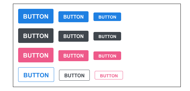
버튼에 outline 추가하기
outline 이라는 옵션을 주면 버튼에서 테두리만 보여지도록 구현
Button.jsx
import classNames from "classnames";
import React from "react";
import "./Button.scss";

function Button({ children, size, color, outline }) {
  return (
    <button className={classNames("Button", size, color, { outline })}>
      {children}
    </button>
  );
}

Button.defaultProps = {
  size: "medium",
  color: "blue",
};

export default Button;
다른 classnames 들과 다르게 객체 안에 집어 넣는다면,
outline 값이 ture 일 경우에만 클래스가 적용된다.
Button.scss
$blue: #228be6;
$gray: #495057;
$pink: #f06595;

@mixin button-color($color){
    background: $color;
    &:hover {
        background: lighten($color, 10%);
      }
    &:active {
    background: darken($color, 10%);
    }
    &.outline {
        color: $color;
        background: none;
        border: 1px solid $color;
        &:hover{
            background: $color;
            color: white;
        }
    }
}

.Button {
  display: inline-flex;
  color: white;
  font-weight: bold;
  outline: none;
  border-radius: 4px;
  border: none;
  cursor: pointer;

  // 사이즈 관리
  &.large {
    height: 3rem;
    padding-left: 1rem;
    padding-right: 1rem;
    font-size: 1.25rem;
    line-height: 3rem;
  }

  &.medium {
    height: 2.25rem;
    padding-left: 1rem;
    padding-right: 1rem;
    font-size: 1rem;
    line-height: 2.25rem;
  }

  &.small {
    height: 1.75rem;
    font-size: 0.875rem;
    padding-left: 1rem;
    padding-right: 1rem;
    line-height: 1.75rem;
  }

   // 색상 관리
   &.blue {
    @include button-color($blue);
  }

  &.gray {
    @include button-color($gray);
  }

  &.pink {
    @include button-color($pink);
  }

  & + & {
    margin-left: 1rem;
  }
}
App.js
import React from 'react';
import './App.scss';
import Button from './components/Button';

function App() {
  return (
    <div className="App">
      <div className="buttons">
        <Button size="large">BUTTON</Button>
        <Button>BUTTON</Button>
        <Button size="small">BUTTON</Button>
      </div>
      <div className="buttons">
        <Button size="large" color="gray">
          BUTTON
        </Button>
        <Button color="gray">BUTTON</Button>
        <Button size="small" color="gray">
          BUTTON
        </Button>
      </div>
      <div className="buttons">
        <Button size="large" color="pink">
          BUTTON
        </Button>
        <Button color="pink">BUTTON</Button>
        <Button size="small" color="pink">
          BUTTON
        </Button>
      </div>
      <div className="buttons">
        <Button size="large" color="blue" outline>
          BUTTON
        </Button>
        <Button color="gray" outline>
          BUTTON
        </Button>
        <Button size="small" color="pink" outline>
          BUTTON
        </Button>
      </div>
    </div>
  );
}

export default App;
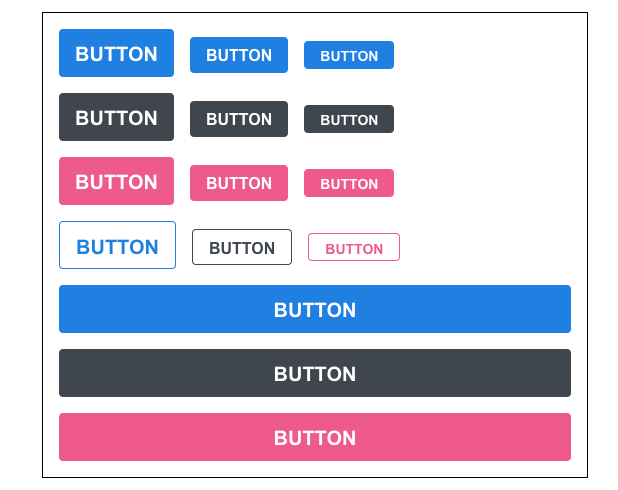
버튼을 전체 너비 차지하게 하기
fullWidth 라는 옵션이 있으면 버튼이 전체 너비를 차지하도록 구현
Button.jsx
import classNames from "classnames";
import React from "react";
import "./Button.scss";

function Button({ children, size, color, outline, fullWidth }) {
  return (
    <button className={classNames("Button", size, color, { outline, fullWidth })}>
      {children}
    </button>
  );
}

Button.defaultProps = {
  size: "medium",
  color: "blue",
};

export default Button;
Button.scss
$blue: #228be6;
$gray: #495057;
$pink: #f06595;

@mixin button-color($color){
    background: $color;
    &:hover {
        background: lighten($color, 10%);
      }
    &:active {
    background: darken($color, 10%);
    }
    &.outline {
        color: $color;
        background: none;
        border: 1px solid $color;
        &:hover{
            background: $color;
            color: white;
        }
    }
}

.Button {
  display: inline-flex;
  color: white;
  font-weight: bold;
  outline: none;
  border-radius: 4px;
  border: none;
  cursor: pointer;

  // 사이즈 관리
  &.large {
    height: 3rem;
    padding-left: 1rem;
    padding-right: 1rem;
    font-size: 1.25rem;
    line-height: 3rem;
  }

  &.medium {
    height: 2.25rem;
    padding-left: 1rem;
    padding-right: 1rem;
    font-size: 1rem;
    line-height: 2.25rem;
  }

  &.small {
    height: 1.75rem;
    font-size: 0.875rem;
    padding-left: 1rem;
    padding-right: 1rem;
    line-height: 1.75rem;
  }

   // 색상 관리
   &.blue {
    @include button-color($blue);
  }

  &.gray {
    @include button-color($gray);
  }

  &.pink {
    @include button-color($pink);
  }

  & + & {
    margin-left: 1rem;
  }

  &.fullWidth {
    width: 100%;
    justify-content: center;
    & + & {
      margin-left: 0;
      margin-top: 1rem;
    }
  }
}
App.js
import React from 'react';
import './App.scss';
import Button from './components/Button';

function App() {
  return (
    <div className="App">
      <div className="buttons">
        <Button size="large">BUTTON</Button>
        <Button>BUTTON</Button>
        <Button size="small">BUTTON</Button>
      </div>
      <div className="buttons">
        <Button size="large" color="gray">
          BUTTON
        </Button>
        <Button color="gray">BUTTON</Button>
        <Button size="small" color="gray">
          BUTTON
        </Button>
      </div>
      <div className="buttons">
        <Button size="large" color="pink">
          BUTTON
        </Button>
        <Button color="pink">BUTTON</Button>
        <Button size="small" color="pink">
          BUTTON
        </Button>
      </div>
      <div className="buttons">
        <Button size="large" color="blue" outline>
          BUTTON
        </Button>
        <Button color="gray" outline>
          BUTTON
        </Button>
        <Button size="small" color="pink" outline>
          BUTTON
        </Button>
      </div>
      <div className="buttons">
        <Button size="large" fullWidth>
          BUTTON
        </Button>
        <Button size="large" fullWidth color="gray">
          BUTTON
        </Button>
        <Button size="large" fullWidth color="pink">
          BUTTON
        </Button>
      </div>
    </div>
  );
}

export default App;
버튼에 ...rest props 전달하기
버튼에 onClick 이벤트를 설정하기 위해서 구현
Button.jsx
import classNames from "classnames";
import React from "react";
import "./Button.scss";

function Button({ children, size, color, outline, fullWidth, onClick }) {
  return (
    <button
      className={classNames("Button", size, color, { outline, fullWidth })}
      onClick={onClick}
    >
      {children}
    </button>
  );
}

Button.defaultProps = {
  size: "medium",
  color: "blue",
};

export default Button;
onMouseMove() 이벤트와 onClick() 이벤트를 둘 다 주고 싶은 그런 상황에는 , spread 와 rest 문법을 사용하자
Button.jsx
import React from 'react';
import classNames from 'classnames';
import './Button.scss';

function Button({ children, size, color, outline, fullWidth, ...rest }) {
  return (
    <button
      className={classNames('Button', size, color, { outline, fullWidth })}
      {...rest}
    >
      {children}
    </button>
  );
}

Button.defaultProps = {
  size: 'medium',
  color: 'blue'
};

export default Button;
...rest 를 사용하면 우리가 지정한 props 를 제외한 값들을 rest 라는 객체에 모아준다.
App.js
import React from 'react';
import './App.scss';
import Button from './components/Button';

function App() {
  return (
    <div className="App">
      <div className="buttons">
        <Button size="large" onClick={() => console.log('클릭됐다!')}>
          BUTTON
        </Button>
        <Button>BUTTON</Button>
        <Button size="small">BUTTON</Button>
      </div>
      <div className="buttons">
        <Button size="large" color="gray">
          BUTTON
        </Button>
        <Button color="gray">BUTTON</Button>
        <Button size="small" color="gray">
          BUTTON
        </Button>
      </div>
      <div className="buttons">
        <Button size="large" color="pink">
          BUTTON
        </Button>
        <Button color="pink">BUTTON</Button>
        <Button size="small" color="pink">
          BUTTON
        </Button>
      </div>
      <div className="buttons">
        <Button size="large" color="blue" outline>
          BUTTON
        </Button>
        <Button color="gray" outline>
          BUTTON
        </Button>
        <Button size="small" color="pink" outline>
          BUTTON
        </Button>
      </div>
      <div className="buttons">
        <Button size="large" fullWidth>
          BUTTON
        </Button>
        <Button size="large" color="gray" fullWidth>
          BUTTON
        </Button>
        <Button size="large" color="pink" fullWidth>
          BUTTON
        </Button>
      </div>
    </div>
  );
}

export default App;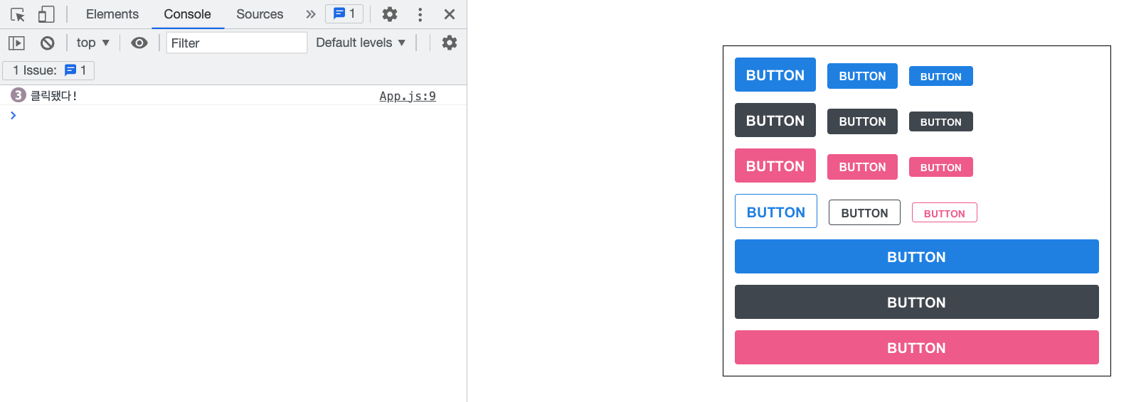
어떤 props 를 받아와야할 지 확실치 않은 상황에서 HTML 태그에게 전달을 해주어야하는 상황에는 ...rest 문법을 사용하면 좋다.
정리
- Sass 을 사용하면 스타일 파일에 유용한 문법을 사용하여 컴포넌트 스타일링 생산성을 높일 수있다.
'CS > 개발지식' 카테고리의 다른 글
| 개발환경 설정 - Webpack (2) | 2022.12.28 |
|---|---|
| 크로스 브라우징 (Cross browsing) (0) | 2022.12.26 |
| 렌더링 엔진 (0) | 2022.12.26 |
| 웹 브라우저의 동작 순서 (0) | 2022.12.26 |
| 코드 리팩토링와 클린 코드 (0) | 2022.12.26 |


